Sample Reporting Images
Clear and insightful reporting is the ultimate goal of data analytics.
Below is a selection of images of and visualizations that can be created to clarify firmwide operations, building asset management and risk assessment. All the data below was extracted from a separate ERP system to be analyzed in Power BI.
Several project metrics on one page
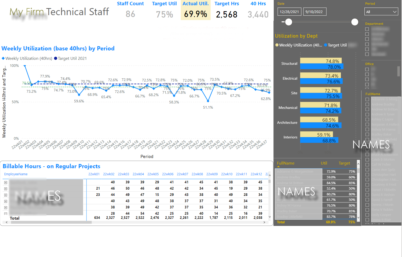
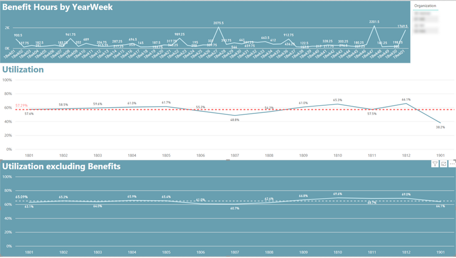
Utilization graphs and tables
Creating Project Budgets at various Levels of Detail
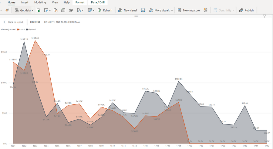
Comparing Projected Revenue to Actual
Invoices Received - ordered by Week
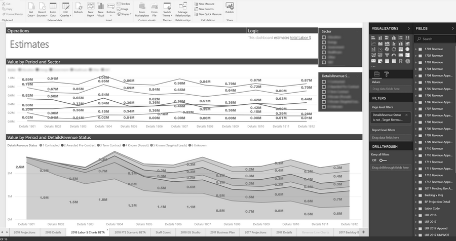
Revenue tracking by Sector
Simple Project List - check
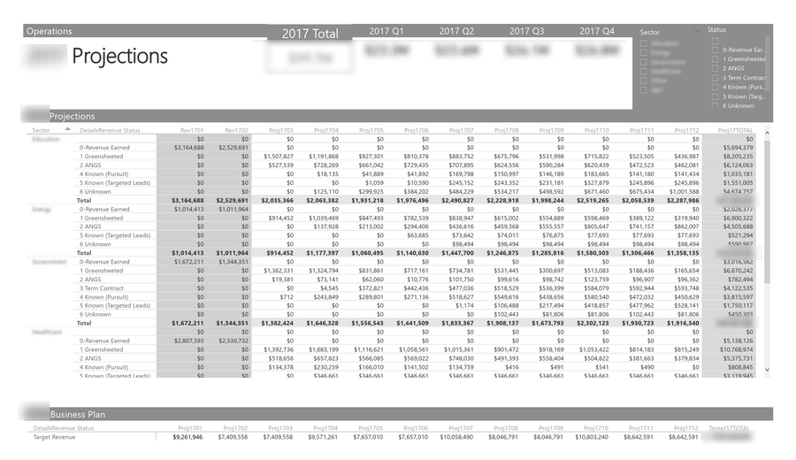
Tracking future project pipeline
Gantt chart based on ERP data
Checking actual revenue vs predicted
Checking billings against hours worked
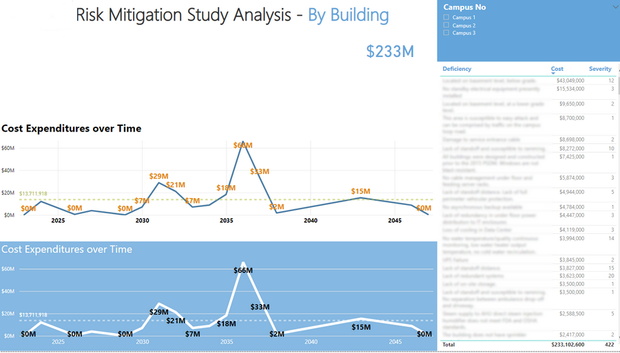
Turing risk factors into future dollars
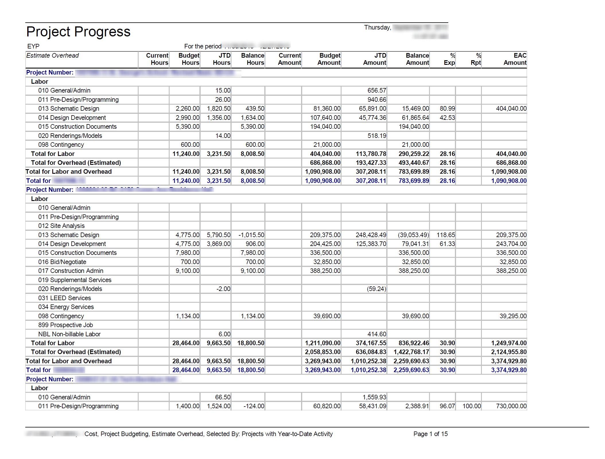
Many ERP reports make it hard to see trends.
Custom visualization showing projects arranged in time with key deadline data.
Simple tables convey a lot of information
Revenue received over time
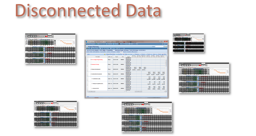
The original Disconnected data issue (2014)
Estimating Revenue from Hours Worked
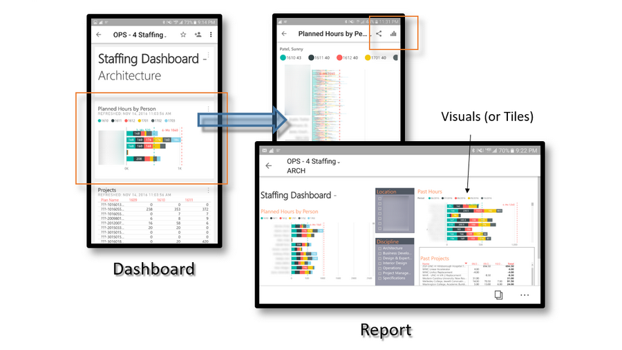
Power BI can be viewed on any device
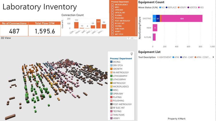
Tracking gas feeds to industrial tool installs
Utilization w and w/out benefits factored
Multiple types of revenue sources layered
Revenue Forecasts at the Project level
Projects w/out contracts
Tracking Future Opportunities
Measuring fee remaining
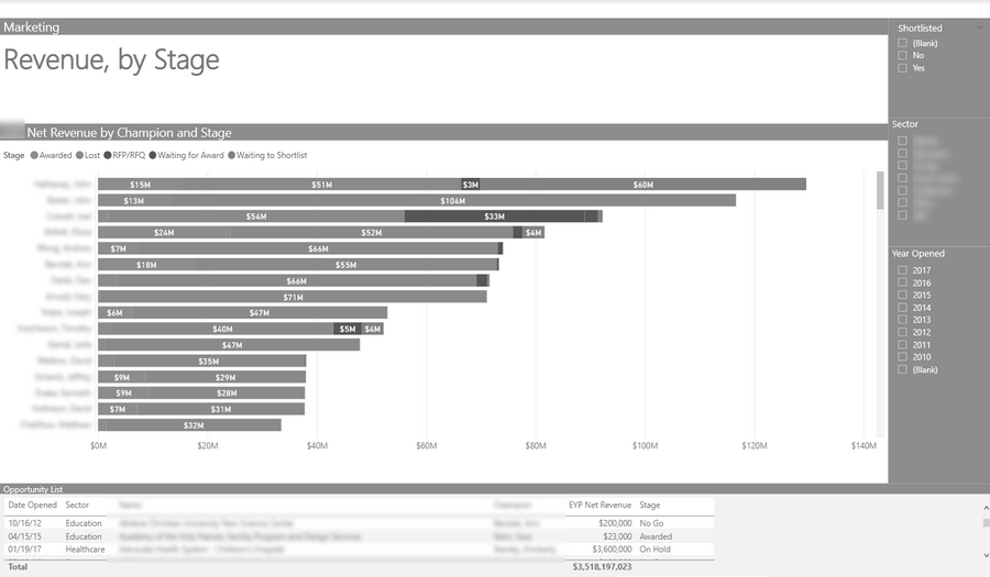
Tracking marketing opportunities by stage
Marketing success metrics
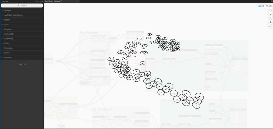
Dynamo extracts data from Revit models
Visualizing building components in Power BI
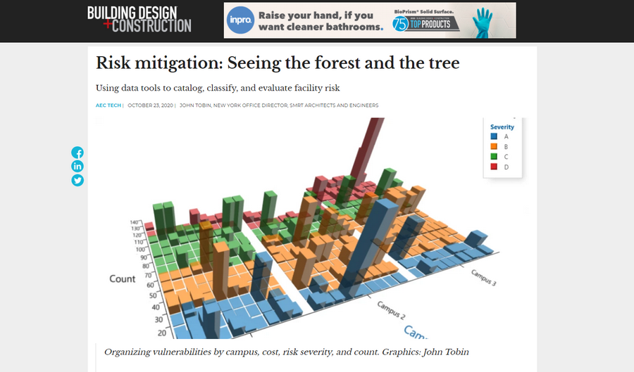
2020 article on measuring failure risk
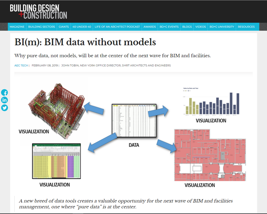
2019 article on data as the next wave of BIM
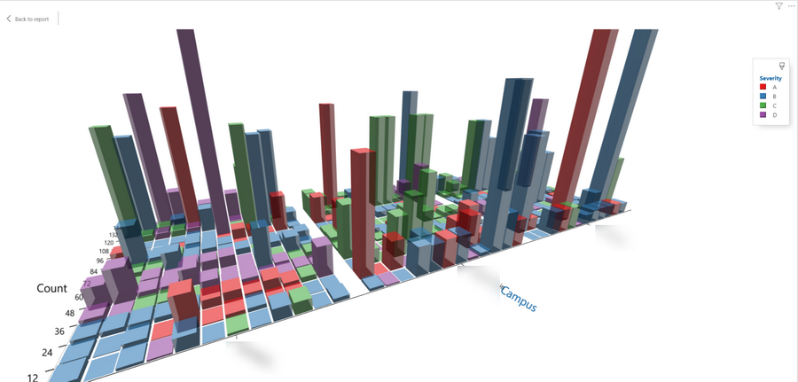
An array of risk items shown in one visual.
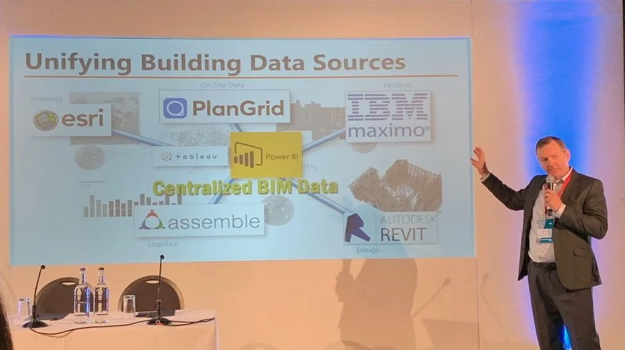
Presenting BI(m) in London 2019
Tracking marketing dollars by champion
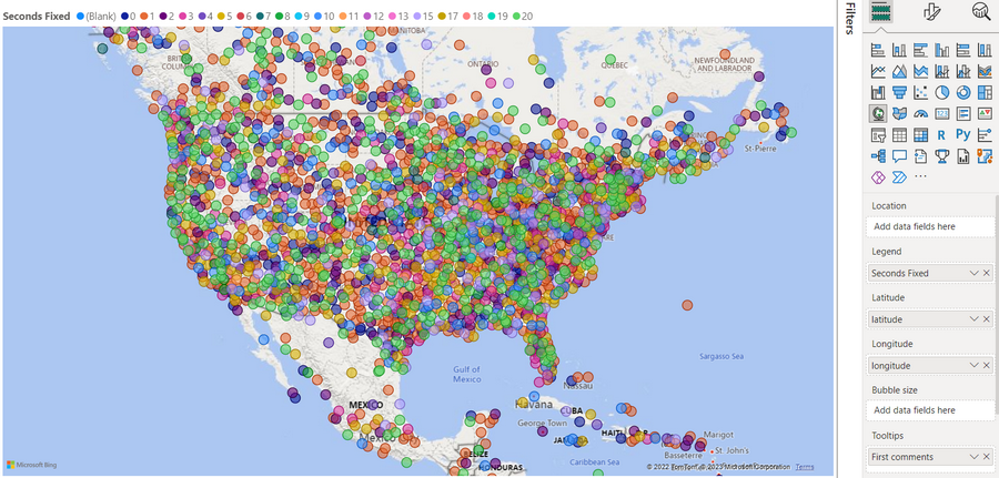
UFO Sightings (using map visual)
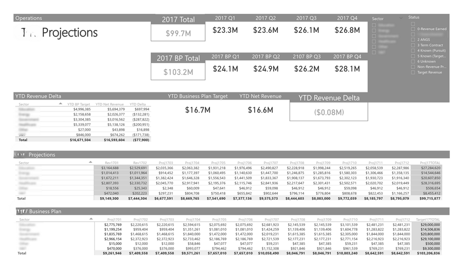
Revenue forecast vs Business Plan
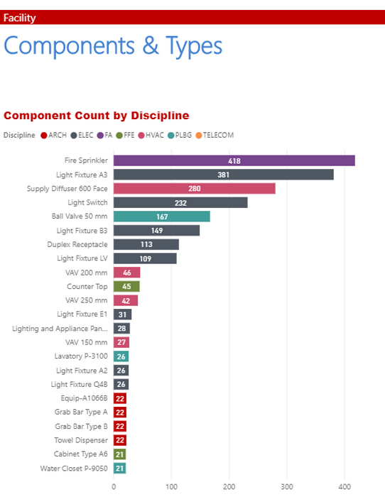
Counting building compoents
BIM and Delivery Images

